Early Printed Labels and Heraldic Bookplates 1580-1680:
In the 16th century bookplates flourished in Germany, several early ones having
been engraved by Durer, but there were at that time few examples in the British Isles:
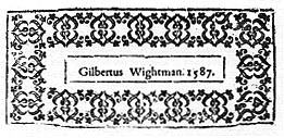 Cardinals Wolsey and Beaton used painted coats of arms (though only single examples are
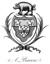
known), some of Nicholas Bacon's books donated to Cambridge University were marked with
a woodcut of his arms first used in Legh's Accedence of Armory, Sir Thomas Tresham used
an engraved armorial bookplate, and Joseph Holand's armorial was a drawing, in the style
of Theodore de Bry. This was a time when ownership was just as likely to have been marked
by a handwritten inscription on the titlepage, or by a gold tooled armorial bookstamp on
the leather covers of a book.

Early Armorial 1680-1715:
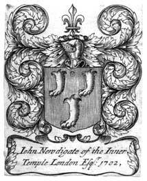
There are rather too few examples of bookplates in the reign of Charles II for the term
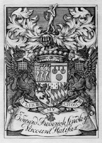
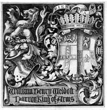
"Carolean" to have much meaning as a style, but see the bookplate of Edward Bysshe in the
gallery of bookplates of heralds. Armorial bookplates only began to be used in
any significant number at the end of the 17th century, when engravers such as White and
Loggan were active. During the reigns of William & Mary and Queen Anne, a group of
engravers based in Holborn, London worked in this Early Armorial style. Actively promoting bookplates
to the nobility, gentry and the professional men in London's legal world, the workshop seems
to have prepared blanks containing just the shield and mantling, ready for the addition of
arms, crest and motto. Where there was no entitlement to supporters, a leafy mantling tumbled
down each side of the arms. Often the crest is too small for the space left available, or a
motto ribbon may be left unused. A pattern book of this workshop has survived, known as the
Brighton Book (its 640 armorial bookplates are in the British Museum's Franks Collection).

Jacobean Armorial 1715-1745:
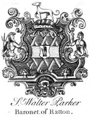
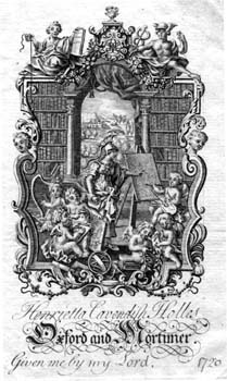
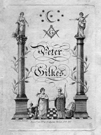
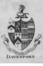
The characteristic frame, having a symmetrical cartouche ornamented with scrolls
and swags, is reminiscent of the woodwork of Grinling Gibbons during the reign of
James II, or of memorial tablets carved in stone at that time. The name Jacobean is a misnomer in the
sense that James had left the throne long before bookplates in this style were current. They
often have fishscales or brickwork as a background pattern to the arms. Shells, cherubs'
heads and terminal figures sometimes feature, or there may be animals standing to each side,
as decoration rather than heraldic supporters. Sometimes the arms are placed on a horizontal
shelf or bracket. This style remained popular for a long period. Some of the Irish examples
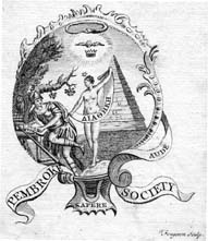
are delightfully inventive and quaint. It was at this period that prize plates (premiums)
came into use by schools when presenting books as rewards to successful students, and that
allegorical and masonic subjects found favour.

Allegorical by G. Vertue |

Allegorical by Fougeron |

Masonic by Cole |

Chippendale Armorial 1740-1770:
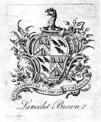
By far the most numerous of 18th century bookplates, this florid style derives from
French rococo, popularised in Thomas Chippendale's furniture designs. This style is
named after him, though he was never an engraver. The asymmetric shield stands within a
cartouche of shellwork, surrounded by leaves and flowers; and many of these bookplates incorporate
charmingly curious pictorial elements such as books, inkwells, cherubs, sheep, and much
else, often reflecting the owner's occupation: a caduceus for a medical man, measuring
instruments for a surveyor, set square and plumb line for a freemason, cannon balls, flags
and other battlefield material for a military officer. Behind the arms we may occasionally
see a landscape as background, or perhaps shipping scenes. Illustrated here is a
bookplate formerly claimed to be of the celebrated landscape gardner, Capability Brown,
but much more likely to have been of his son, who bore the same name. By the 1770's, rococo
was out of fashion, and later styles were more restrained.
Festoon, Wreath and Ribbon,
and Spade Shield Armorial 1770-1810:
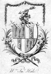
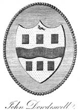
The swags of flowers, leaves or husks, hanging down from wall pins or from a ribbon, are
the festoons. The arms are generally borne on a spade-shaped shield, underneath which may be two
or more wreaths, crossing over and tied together with a ribbon. Strictly speaking, a Festoon
Armorial has just the swags hanging down, and a Wreath and Ribbon Armorial comprises just
the shield and wreaths below. In about the period 1795-1820 the spade shield was often left
unadorned, so the style became simply a Spade Shield Armorial, sometimes placed in a garter.

Wreath & ribbon without festoon |

Festoon, wreath & ribbon |

Spade shield on a beaded teatray |

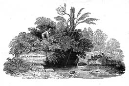
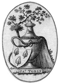
Landscape and Pictorial 1780-1820:
Views of ruined buildings, tombs and urns were quite popular in the 1780's and 1790's.
Where an armorial was required, the shield was placed against a rock or tree and was often
secondary to the main design. Thomas Bewick's landscape scenes, cut on the endgrain of the
wood block, found a wide following in the thirty years spanning the start of the 19th century
(as comprehensively recorded in Nigel Tattersfield's "Bookplates by Beilby and Bewick",
pub. 1999 by The British Library).

Urn & armorial |

Spade shield armorial |

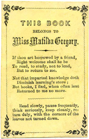
c.1820s label |

Plain Armorial 1800-1900:
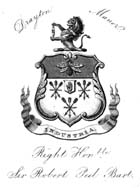
Most 19th century bookplates are unadorned armorials, unrelieved by any pictorial element
and with no attempt to impart any life or three-dimensional quality to the arms. The
heraldic stationers of the 19th century produced thousands of these, as well as catering
to their clients' other needs, such as wax seals and signet rings. Sometimes no effort was
made to ensure that the heraldry was accurate, or that the owner was entitled to bear arms.
Collectors thus refer perjoratively to these plain armorials as "diesinkers", meaning that
they were produced in quantity with little artistic flair. A few of these plain armorials
were for well known people, but often those who distinguished themselves in public life did
not trouble to obtain a bookplate, or if they did, it was unremarkable in design. However,
once the habit of using an exlibris was established within a family, we may find the same arms
and motto is use over several generations; so although this style holds little merit for the
bookplate collector, it can nonetheless be of value to family historians interested in
quarterings, impalements, escutcheons of pretence and cadency marks. Ilustrated here is the
bookplate of the prime minister, Sir Robert Peel.


Crests:
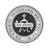
These two crest plates were not used by the famous engineer Brunel, but by his son of the same name. It may sometimes be
quite difficult to identify an anonymous crest bookplate. This is where the catalogue of the
Franks Collection can be of value, by reference to its heraldic index of anonymous plates and
crests. However, there are many plain armorials and crests that are categorised by collectors
as "Not in Franks". A union catalogue (see Projects) will help but will never completely
determine ownership. Indeed, sometimes a bookplate was used by succeeding generations within
a family, rather than by one individual owner.
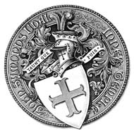
Seal Armorial, from 1800:
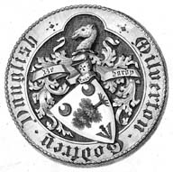
A more pleasing alternative, referring back to medieval wax seals, was to adopt a circular
design, with the arms centrally and either a motto or the ownership inscription running round
the outside. In the example
illustrated (F.13781), we see neither "Ex Libris" (from the books) nor "Sigillum" (the seal)
but "Arma" (the arms) "Ricardi Harington" (of Richard Harington) "et Cecilie uxoris ejus"
(and of Cecily his wife).

Seal Armorial |

Architectural |

Seal Armorial |
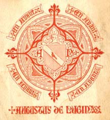
Architectural 1840-1860:
It is no surprise that Gothic elements feature in the exlibris of Augustus Pugin. In other
bookplates, such as those by Henry Le Keux and the brothers Orlando and Llewellyn Jewitt,
the design is often circular and incorporates tracery similar to that found in church windows.
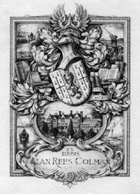
Golden Age Armorials 1890-1910:
There was an upsurge of interest in bookplates at the end of the Victorian era. Foremost amongst
the engravers on copper was Charles William Sherborn, who created over 500 bookplates. There
were mostly armorial, as was the etched work of George W. Eve. Much pictorial work, often depicting
the owner's home and interests, was commissioned by upper class English society from the Bumpus
and Truslove and Hanson bookshops, who employed a choice of engravers, including Harrison and Osmond.

by C.W. Sherborn |

by G.W. Eve |

by J.A.C. Harrison |
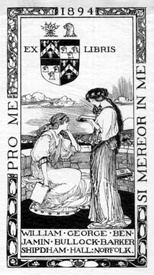
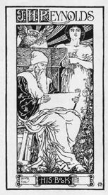
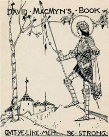
Pictorials by Book Illustrators and Others 1880-1910:
This flowering of interest in bookplates coincided with a time when greater attention was being
given to the art of decorating books attractively, and the same designers were often active in
both fields.

by Robert Anning Bell |

by Henry Ospovat |

by Jessie M King |
20th Century Pictorials:
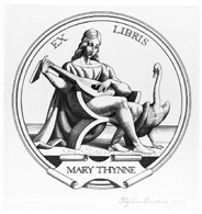
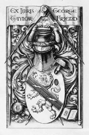
The trend has been away from armorial bookplates, and we see here some fine engraved work by
Eric Gill, Stephen Gooden and George Taylor Friend.

by Eric Gill |

by Stephen Gooden |

by George T. Friend |
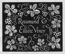
Calligraphic 1950-Present Day:
The writing-masters of the eighteenth century displayed their skill in a riot of
extended flourishes and curlicues. 20th century calligraphic bookplates have been far
more restrained. Gill's engraved work
on wood inspired Reynolds Stone ( -19xx), Leo Wyatt and many others, including Will Carter and
David Kindersley, whose calligraphic labels were, in fact, drawn, not engraved. Some other wood-
engravers following in this vein have been Diana Bloomfield, Derek Riley, Reg Boulton.

by Reynolds Stone |

by Kindersley |

by Wyatt |
We can show here only a slight glimpse of the range of bookplate design. Each artist develops his own style which becomes readily
recognisable. The evolution of bookplate styles makes it possible to attribute a reasonably accurate estimate of date to each bookplate.
Please note that the bookplates illustrated above are resized to fit the page conveniently and are not shown to scale.


 Cardinals Wolsey and Beaton used painted coats of arms (though only single examples are
known), some of Nicholas Bacon's books donated to Cambridge University were marked with
a woodcut of his arms first used in Legh's Accedence of Armory, Sir Thomas Tresham used
an engraved armorial bookplate, and Joseph Holand's armorial was a drawing, in the style
of Theodore de Bry. This was a time when ownership was just as likely to have been marked
by a handwritten inscription on the titlepage, or by a gold tooled armorial bookstamp on
the leather covers of a book.